
Home Staging Color Schemes: Top Tips for a Successful Sale
Home staging is a crucial aspect of preparing a property for sale by enhancing its visual appeal to potential buyers. Choosing the right color scheme is one of the most important factors in successful home staging. By selecting the appropriate hues, a home can appear more inviting and help potential buyers envision themselves living in the space. Color schemes should complement the overall style and architecture of the house while also adhering to current design trends to make the property stand out.
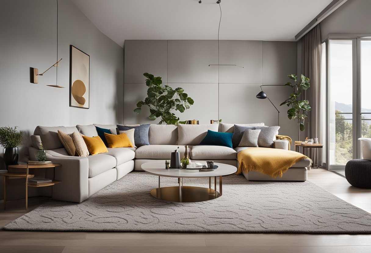
Fundamentals of home staging color schemes involve choosing a palette that creates a cohesive and harmonious feel throughout the space. Neutral tones are often preferred to allow buyers to easily imagine their personal touches within the home. Additionally, understanding how different colors can influence the atmosphere in each room is crucial for creating a comfortable and appealing vibe.
When it comes to accent colors and accessories, strategic placements can highlight the home’s best features while drawing attention away from any potential flaws. Lighting, paint finishes, and exterior staging all present a home in the best possible light. As seasons change, so too can the choice of color schemes, making it important to stay informed about current trends and update home staging accordingly.
Key Takeaways
- The appropriate color scheme can enhance a home’s visual appeal during the staging process.
- Neutral tones and strategic accent colors create a harmonious and inviting atmosphere.
- Consideration of lighting, exterior staging, and seasonal trends is crucial for successful home staging.
Fundamentals of Home Staging Color Schemes
Importance of Color in Home Staging
Color plays a crucial role in home staging as it can significantly impact a buyer’s perception of the space. A well-selected color palette creates a welcoming atmosphere and helps to highlight the best features of the home. According to The Best Interior Colors for Home Staging, the interior colors should appeal to the most buyers possible. Therefore, it’s essential to choose neutral and calming paint colors that have a wide appeal and allow potential buyers to visualize the space as their own.
Understanding Color Psychology
To make informed choices about color schemes, it’s essential to understand color psychology. Different colors can evoke different emotions and reactions from people. Here are a few examples:
- Blue: Calming and soothing, this color is ideal for bedrooms and bathrooms.
- Green: Symbolizing nature and growth, green is perfect for creating a tranquil environment.
- Red: Energetic and stimulating, red is suitable for social spaces such as living rooms but should be used sparingly.
- Yellow: Warm and inviting, this color works well in kitchens and breakfast nooks.
When staging a home, opt for more subdued shades and tones to create a harmonious space that attracts a broad range of buyers. When selecting a color scheme, it’s also essential to consider the room size, natural light, and style. The ideal goal is to evoke positive emotions and create a welcoming atmosphere that makes potential buyers feel comfortable and at home.
Choosing the Right Color Palette
When it comes to home staging, selecting the appropriate color palette can significantly impact prospective buyers. In this section, we’ll discuss the effectiveness of neutral tones and how to use bold colors strategically.
Neutral Tones and Their Effectiveness
Neutral colors, such as beige, gray, and white, are often recommended for home staging due to their versatility and ability to create a peaceful, inviting atmosphere. These colors enable potential buyers to envision themselves living in the space while also providing a clean, fresh canvas that allows the home’s architectural features to take center stage.
Some advantages of using neutral tones include:
- They appeal to a wide range of tastes, increasing the likelihood of attracting buyers.
- They help to create a sense of spaciousness and openness.
- They allow for seamless coordination with various styles of furnishings and decor.
For more tips on how to select the most suitable neutral color palette for your staged home, consider this helpful guide.
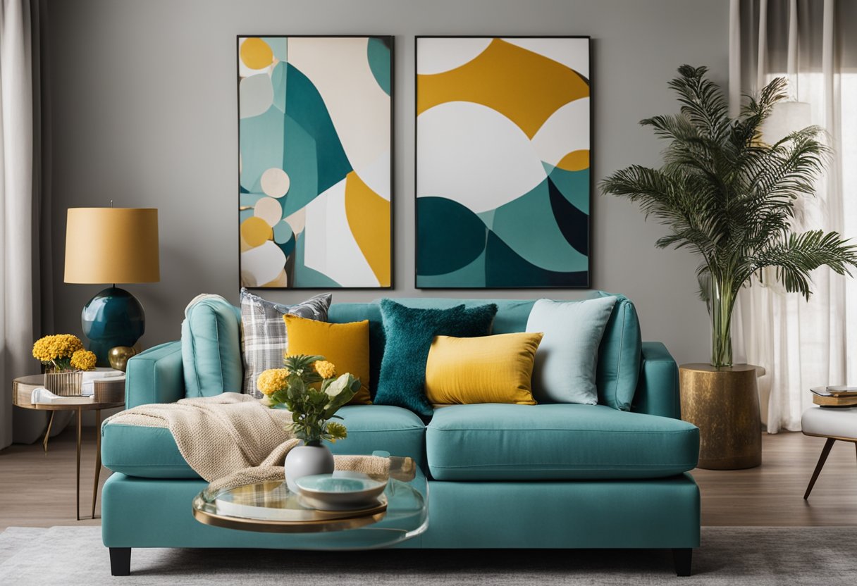
Using Bold Colors Strategically
While neutral tones are often preferred for home staging, that doesn’t mean bold colors should be entirely avoided. When used strategically, bold colors can add a sense of character and style to space. The key is to strike a balance between making a statement and not overwhelming potential buyers with excessively strong colors.
Here are some tips for incorporating bold colors effectively:
- Accent walls: Choose one wall in the room to paint a bold color, creating a focal point without overpowering the space.
- Accessories: Introduce color through easily replaceable items, such as pillows, artwork, or decorative accents.
- Patterned textiles: Use patterned fabrics with a mix of neutral and bold colors that complement each other.
When working with bold colors, it’s essential to be mindful of the overall color palette, ensuring a cohesive, harmonious look. The goal is to draw attention to the best features of the home while still allowing potential buyers to imagine their own style and taste within the space.
Color Schemes for Different Spaces
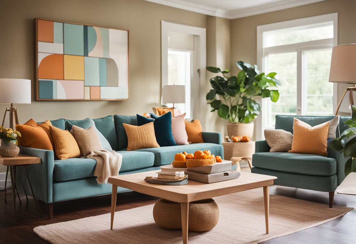
Living Room Color Choices
The living room is often the center of attention in a home. Therefore, consider using a color scheme that reflects the desired atmosphere and energy level. Some popular color choices include:
- Neutral Tones: Choose shades like beige, gray, and white to create a calm, sophisticated atmosphere.
- Primary Colors: Use red, blue, and yellow to create a vibrant, energetic space.
- Earth Tones: Opt for greens, browns, and warm yellows to create a welcoming, cozy environment.
It’s important to consider how these colors interact with existing furniture and natural lighting.
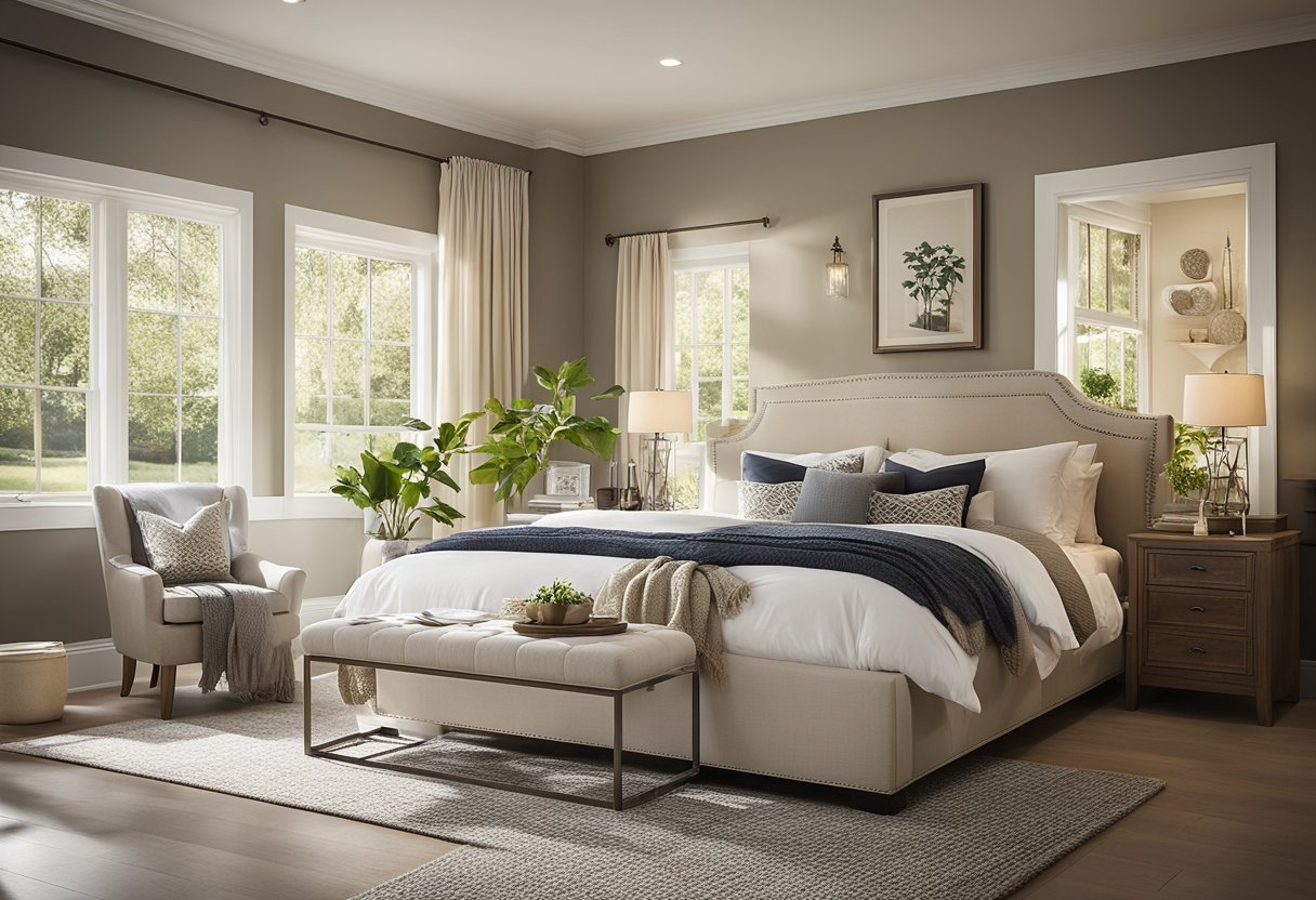
Bedroom Color Selection
The bedroom is a place for relaxation and rejuvenation. Select color schemes that promote rest and relaxation:
- Cool Colors: Using blue, green, and lavender can create a soothing and peaceful atmosphere.
- Neutral Tones: Pale grays, whites, or beiges lend an elegant and serene backdrop.
- Warm Colors: Opt for subtle shades of yellow or pink to create a comforting, enveloping feel.
Play with different combinations of colors or patterns using throw pillows, blankets, and wall art to personalize the space.
Optimizing Kitchen Colors
Kitchen color schemes should be functional and energizing to inspire culinary experiences. Some useful color combinations are:
| Dominant Color | Accent Colors |
|---|---|
| Red | Gray, white, black |
| Yellow | White, gray, black |
| Green | White, wood tones, darker shades of green |
Use these accents in fixtures, appliances, and decorative items to create a cohesive kitchen color scheme.
Bathroom Color Schemes
Bathroom color choices should provide a clean and relaxing environment. Some color options to consider are:
- White and gray: This combination brings a modern and minimalist aesthetic to the space.
- Pale blue, green, or beige: These tones create a calming and soothing atmosphere.
- Dark and luxurious hues: Indulge in deep shades like navy, dark green, or even black to create a sophisticated bathroom retreat.
Reflect on lighting and fixture choices to further enhance the chosen color scheme in the bathroom.
Accent Colors and Accessories
Incorporating Accent Colors
Creating a visually appealing space when staging your home is vital. By skillfully incorporating accent colors, you can draw attention to specific areas and desired features. For inspiration, check out Pinterest. Introduce accent colors through furnishings, such as throw pillows, artwork, and area rugs, by using shades complementary to the room’s primary color scheme.
A good practice is to apply the 60-30-10 rule. This includes:
- 60% primary color (walls and flooring)
- 30% secondary color (furniture)
- 10% accent color (accessories)
Selecting the Right Accessories
Choosing the right accessories adds a personal touch to your staged home while maintaining a neutral and cohesive look. Use this strategic approach for a polished outcome:
Stick to a color palette: Keep your accessories within a consistent color scheme, allowing them to complement the primary colors and create harmony.
Throw pillows: Incorporate throw pillows in your furnishings to provide texture and color contrast, making the space more inviting. Opt for different sizes, shapes, and patterns that follow your chosen color palette.
Scale and proportion: Ensure accessories are the right size and complement each other. Avoid overcrowding or using oversized items that can make the space look cluttered.
Balance and symmetry: Distribute accessories evenly across the room, placing them in groups and creating a natural flow.
By carefully selecting and placing accent colors and accessories, home staging color schemes can effectively showcase the room’s potential and leave a lasting impression on potential buyers. Remember to maintain a balanced visual appeal, focusing on the room’s overall appearance while emphasizing its most attractive features.
Home Staging Colors Through the Seasons
When it comes to home staging, staying on top of seasonal color trends is essential for creating a space that feels current and inviting. In this section, we’ll explore the various seasonal color trends that can help transform a home for sale throughout the year.
Seasonal Color Trends
Spring: Fresh and Vibrant
Home buyers are drawn to light, fresh, and vibrant colors as the weather warms and the days grow longer. Think about incorporating pastels, light neutrals, and soft greens that reflect the colors of the blossoming season. Some popular spring hues include:
- Powder blue
- Soft coral
- Mint green
- Butter yellow
Summer: Bright and Cheerful
During the summer months, home staging often adopts a brighter and more cheerful color palette to capture the essence of the season. Incorporate pops of bold, saturated colors to create a vibrant and inviting atmosphere. Some trendy summer hues include:
- Sunflower yellow
- Teal blue
- Coral
- Lime green
Autumn: Warm and Cozy
Buyers seek comfort and warmth within a home’s interior as the leaves fall and the temperatures drop. Emphasize warm, rich, and inviting colors inspired by the season’s changing foliage. Here are some popular autumn colors to consider:
- Burnt orange
- Rich cranberry
- Golden yellow
- Warm brown
Winter: Cool and Calming
During winter months, home staging should focus on creating a cozy and inviting haven from the harsh weather outside. Utilize cool, calming tones that evoke a tranquil and serene environment. Some popular winter color options include:
- Icy blue
- Deep navy
- Crisp white
- Dove gray
By staying informed about the latest seasonal color trends, you can greatly enhance the appeal of a home throughout the year. So, be sure to update the colors in your staged rooms to create an environment that reflects the current season’s comfort and ambiance.
Impact of Lighting on Color Perception
When designing home staging color schemes, it’s crucial to consider the impact of lighting on color perception. The type and quality of light sources in a space can significantly alter the appearance of colors, making them appear either brighter or duller than expected.
Natural vs Artificial Lighting
When choosing colors for home staging, it’s essential to consider the different effects of natural and artificial lighting. Natural light from the sun provides a full spectrum of light, which allows us to perceive colors accurately. However, as natural light changes throughout the day, so do the colors in the space.
- Morning light is typically cooler and provides a bluer tone to colors.
- Afternoon light tends to be warmer, casting a golden hue on colors.
- Evening light can be a mix of warm and cool tones, with colors often appearing more muted.
In contrast, artificial lighting varies based on the type and energy efficiency of the light source. There are three main types of artificial lighting:
- Incandescent – These lights produce a warm, yellowish light that can enhance warm colors but may distort cool colors.
- Fluorescent – These lights emit a cool, blueish light that can make colors appear washed out or overly bright.
- LED – These lights offer a wide range of color temperatures, enabling a more accurate color representation.
When planning your home staging color scheme, consider how the space will be primarily used and the types of lighting present. For example, a living room with large windows may rely heavily on natural light, whereas a room with limited windows might utilize more artificial lighting.
Here’s a table to guide color choices based on lighting:
| Lighting Type | Best Colors to Enhance |
|---|---|
| Natural | All Colors |
| Incandescent | Warm Colors (reds, oranges, yellows) |
| Fluorescent | Cool Colors (blues, greens, purples) |
| LED | Depends on selected color temperature |
In conclusion, selecting colors that will look their best under the lighting conditions available in the space being staged is vital. By considering the unique characteristics and effects of both natural and artificial light sources, you can ensure that the chosen color scheme creates the desired visual impact, and helps the home appear warm, inviting, and appealing to potential buyers.
Finishing Touches with Paint and Finish
When it comes to home staging, the perfect color scheme can significantly affect how a space is perceived. While the overall design and layout are essential factors, the finishing touches of paint and finish can transform a room into a stunning, cohesive space.
Selecting the Right Paint Finish
Choosing the appropriate paint finish is just as important as selecting the right paint color. The various paint finishes available have distinct characteristics and can greatly affect the appearance of a room. Below is a brief overview of common paint finishes that can guide you in making an informed decision:
Matte Finish:
- Pros: Hides imperfections well, non-reflective, ideal for low-traffic areas
- Cons: Not as durable, can be difficult to clean
Eggshell Finish:
- Pros: Slight sheen, more durable than matte, easy to clean, ideal for moderate-traffic rooms
- Cons: May show some imperfections, less shine than other finishes
Satin Finish:
- Pros: Soft sheen, easy to clean, suitable for high-traffic areas, ideal for kitchens and bathrooms
- Cons: Can show some imperfections, not as durable as semi-gloss and gloss finishes
Semi-Gloss Finish:
- Pros: More durable, easy to clean, ideal for trim and molding
- Cons: Imperfections are more visible, slightly reflective
Gloss Finish:
- Pros: Highly durable, easy to clean, great for high-traffic areas and trim work
- Cons: Imperfections are very visible, can be too reflective for some preferences
When selecting the right paint finish for a room, consider factors such as the amount of natural light, size, and intended use. Lighter paint finishes can make a room appear larger and brighter, while darker finishes may create a more intimate, cozy atmosphere.
Don’t hesitate to mix finishes within a space, either. For instance, utilizing a semi-gloss finish for trims, moldings, and doors can create a subtle contrast and add interest to a room.
In conclusion, the finishing touches of paint and finish play a crucial role in achieving a cohesive and inviting home staging. Keeping in mind the different qualities and applications of paint finishes ensures a successful result that complements the color scheme chosen for the staged space.
Home Staging Color Scheme Tips and Tricks
Creating a Spacious Feel with Color
To create a more spacious feel in a home, it’s important to choose the right color schemes. A simple and effective technique is to use a monochromatic color scheme, which involves selecting one color and using various shades and tints of that color throughout the space. This creates a sense of unity and helps to visually expand the room.
Here are some tips for creating a spacious feel with color:
- Choose lighter colors: Lighter colors, such as soft whites, light grays, and subtle pastels, can make a room appear larger and more open.
- Minimize contrast: Avoid high-contrast color combinations, which can make a space feel smaller and more cramped.
- Incorporate multi-functional furniture: Choosing furniture that serves multiple purposes can help to create the illusion of more space.
| Furniture Type | Function |
|---|---|
| Ottoman | Seating & Storage |
| Sofa bed | Seating & Sleeping |
| Wall-mounted desk | Workspace & Storage |
Avoiding Common Color Mistakes
A few common color mistakes can be easily avoided when home staging. Here are some tips for preventing color mistakes during your staging:
- Keep color palettes simple: Limit the color palette to three or four coordinating colors to maintain a cohesive and visually appealing look.
- Avoid overly bold colors: Bold, vibrant colors can be overwhelming and distract potential buyers from the home’s features. Stick to neutral and soft colors.
- Consider color psychology: Certain colors evoke specific emotions, such as calm, excitement, or warmth. Choose colors that evoke the desired mood for each room.
- Training for color expertise: Ensure the home stagers have adequate training on color schemes to prevent wrong color choices and mistakes.
In summary, when staging a home, the choice of color schemes plays a crucial role in creating a spacious feel and avoiding common color mistakes. By keeping these tips and tricks in mind, home stagers can create a visually appealing and welcoming space for potential buyers.
Exterior Home Staging and Color
Boosting Curb Appeal with Color
When staging a home for sale or rent, the importance of exterior home staging cannot be overstated. One of the key elements to consider is the choice of color scheme. A well-thought-out color palette can significantly enhance the home’s curb appeal and attract potential buyers or renters.
- Front Door: A front door should be eye-catching and inviting. Consider using a bold, contrasting color that complements the rest of the exterior. Some popular choices are:
- Deep red
- Vibrant blue
- Rich green
- Main Exterior: Choose a neutral yet attractive color for the main exterior. This allows the house to blend in with its surroundings while still standing out to potential buyers and renters:
- Soft beige
- Warm gray
- Creamy white
- Trim and Accents: Accentuate important architectural features of the home with carefully selected accent colors. Ensure that these colors work well with the main exterior and front door colors but provide a splash of personality and style:
- Cool gray for trim
- Eye-catching white for window sills and railings
- Subtle pastels for shutters
A successful exterior color scheme should boost the home’s curb appeal and showcase its unique features. It is essential to strike a balance between blending in with the neighborhood and creating a memorable first impression for buyers or renters. By focusing on the interplay of colors for the front door, main exterior, and accents, homeowners can significantly increase the appeal of their property and potentially expedite the sales or rental process.
Luxury Specialist at McGraw Realtors
With a diverse background, including a career as an Air Force fighter pilot and entrepreneurship, Bill transitioned to real estate in 1995. Co-founding Paradigm Realty with his wife, Charlene, he quickly rose to prominence in Oklahoma City’s luxury real estate scene. Now, as one of the top agents with annual sales surpassing $20 million, Bill’s dedication to exceptional service remains unparalleled. With a legacy spanning over two decades in the industry, Bill’s expertise and commitment make him a trusted name in luxury real estate.